
The Grid as Landscape
Why the best editorial layouts feel like places you can walk through.
A grid is not a cage. It is a landscape with paths, clearings, and edges. The reader moves through it the way a walker moves through a park - drawn by openings, pausing at views.
The spatial logic of the page
Magazine design borrowed its vocabulary from architecture long before the digital era made that borrowing explicit. Columns are walls. Gutters are corridors. The bleed is the edge of the building. White space is not emptiness - it is air, the thing that makes the built elements readable.
When Josef Müller-Brockmann codified the Swiss grid system in the 1950s and 60s, he was not inventing a method so much as articulating what good designers had always done intuitively. The grid gave structure to intuition. It made legible the spatial logic that experienced designers applied but rarely described.
Clearings and paths
The best magazine layouts understand movement. They use white space as breathing room, not emptiness. They let photographs bleed because containment would diminish them. They understand that the reader’s eye, given a choice between a dense block of text and an image, will choose the image - and that this is not a problem to be managed but a fact to be designed with.
A well-designed spread has clearings: moments of visual rest that allow the eye to pause before continuing. It has paths: sequences of elements that guide the reader from entry point to conclusion. The designer is not just arranging elements. They are choreographing movement through a space that exists only in two dimensions but implies a third.
Modular grids as vocabulary
Modular grids - grids with both vertical columns and horizontal rows - give the designer a vocabulary of proportions. A one-column module is a caption. A two-column module is a pull quote. Four columns is a full spread image. The relationships between modules carry meaning independent of content.
This vocabulary allows the experienced designer to improvise. Just as a jazz musician works within a harmonic structure to produce spontaneous variation, the editorial designer works within a grid to produce layouts that feel both inevitable and surprising. The constraint is what makes freedom possible.
When grids fail
Grids fail when they become ends rather than means. The sign of a grid that has been applied rather than inhabited is rigidity: every element in its designated zone, no dialogue between columns, no tension between elements. The page looks resolved but feels inert.
The best editorial designers know when to violate the grid. A photograph that breaks the column boundary gains energy from doing so. A headline set across a gutter disrupts the reader’s expectation productively. But these violations only work because the grid exists as a reference. Without the structure, the break means nothing.
What digital lost and is finding again
Early web design had no real grid - elements floated or were hacked into position with tables. CSS Grid, arriving in 2017, gave web designers what print designers had for decades. The resulting explosion of experimental web typography suggests that the constraint was what was missing.
The landscape metaphor still holds. What you say with the grid - which paths you open, which clearings you create, what views you offer the reader from where - is still up to you. The grid is the terrain. The layout is the walk.
- ★★★★★
A grid is not a cage. Every design student should read this. Short, precise, and genuinely useful.
- ★★★★★
The comparison between magazine layouts and walking through a park is one I will be stealing for client presentations.
- ★★★★★
Modular grids as vocabulary rather than constraint. Exactly the framing that was missing from my workflow.
Leave a review
Sample reviews above are demo content. On a Netlify deploy this form is collected with Netlify Forms; it does not appear in the list until you connect a CMS.

The Geometry of Quiet Rooms
How negative space, daylight, and a single axis of furniture can make a room feel finished without feeling full.
Type That Holds a City Together
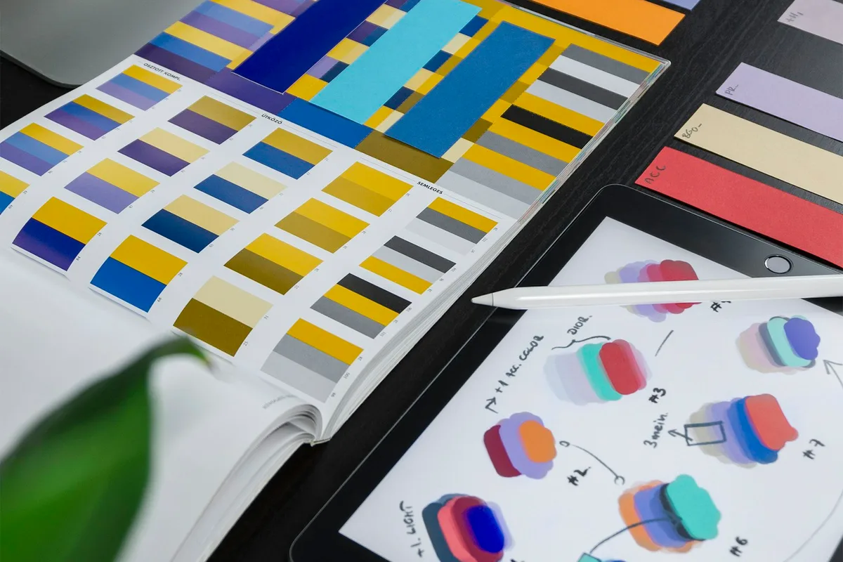
Why wayfinding, newspaper mastheads, and subway maps still teach the best lessons in hierarchy.
Summer Light, Winter Grids
On designing for season and why the best editorial systems change with the months.