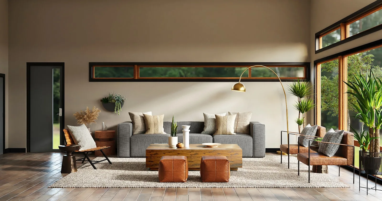
The Geometry of Quiet Rooms
How negative space, daylight, and a single axis of furniture can make a room feel finished without feeling full.
There is a moment, usually late afternoon, when a room reveals whether it was designed or merely furnished. Light slides across a plane. Edges hold. Silence gets a shape.
Swiss modernism taught generations of designers to treat emptiness as structure. The empty field is not a lack - it is a measured interval, as intentional as a column. The room that understands this is a different kind of space from the room that is simply not yet full.
Begin with one axis
Pick a single line through the room: a table, a window wall, a shelf. Everything else should negotiate with that axis. When furniture fights for dominance, the eye never rests.
This is not a rule about minimalism specifically. It is a rule about legibility. A room with a clear organising axis can contain many things without feeling chaotic, because the things relate to each other through that axis. A room without one can contain very few things and still feel unresolved.
The axis does not have to be visible. It can be implied by alignment - objects placed at the same distance from a wall, or oriented toward the same source of light. The reader of the room perceives the order without necessarily identifying its source. This is the same mechanism by which a well-designed grid makes a page feel settled without the reader knowing what a grid is.
Clarity is not austerity. It is the decision to let one thing speak first.
Daylight as material
Treat daylight like timber or stone. Track where it lands at 9am, noon, and dusk. Place the quietest surfaces where the light is most dramatic - plaster, linen, unfinished oak. Reserve the active surfaces for zones of shadow where they will not compete with the light itself.
This is a form of casting, borrowed from theatre. Stage lighting works not by illuminating everything equally but by directing attention. The room that is designed around daylight does the same thing. At a specific hour, light falls on a specific surface. That surface, chosen for its relationship to that light, becomes the room’s focal point. Tomorrow at the same hour, it will happen again.
The implication is that the room should be visited at different times of day before furniture decisions are made. Many interior design mistakes result from decisions taken under artificial light or at a single time of day, without accounting for what the room will become when conditions change.
The proportional argument
Minimalism has a reputation for severity that its best practitioners find baffling. The quiet room is not a room that has been stripped or denied. It is a room that has been proportioned.
Proportion is not about reduction. It is about relationship. A room with few elements in strong proportional relationships with each other is a room of great density - dense with meaning, with spatial relationships, with the particular quality of attention that resolves arrangement creates in the person who inhabits it.
The spare interior is rich in the same way that a string quartet is richer than an orchestra playing at full volume. The reduction in elements concentrates attention. Every relationship becomes audible. There is nowhere for poor proportions to hide.
Edit until the room exhales
Remove one object. Wait a day. If the room feels more itself, keep going.
This is the most important instruction in interior design and the least followed. It requires patience - the willingness to live with less for long enough to feel whether less is, in this case, more. Most rooms are furnished in anticipation of use patterns that take months to establish. The furniture is in place before the room is understood.
The editorial approach to the room - the recognition that the art of the space lies as much in what is removed as what is included - is difficult to maintain against the pressure of utility, sentiment, and the accumulative logic of domestic life. Things arrive in rooms. They settle. They become fixtures.
The discipline required is the same as in any editing practice: the willingness to question what is there not because it is bad but because the space without it might be better. Some rooms need more. Most rooms need less. The room that has been edited until it exhales is the room where, late in the afternoon, when the light slides across the floor and the edges hold, silence finally gets a shape.
What quiet actually is
Quiet is not the absence of something. It is the presence of attention.
The quiet room is a room that has been attended to - by someone who looked at it carefully and made decisions about it that were calibrated not to the appearance of the room but to the experience of inhabiting it. These are different design briefs. The room that photographs well is not always the room that is good to live in. The room that is good to live in often photographs as nearly empty.
The geometry of the quiet room is invisible from the outside. It becomes apparent in time, through habitation - through the accumulation of small perceptions that add up to a sense that this space was designed for the experience of being in it, rather than for the impression of it.
That is what all rooms, finally, are for.
- ★★★★★
Quiet is not the absence of something but the presence of attention. That sentence changed how I think about the rooms I design.
- ★★★★★
This is the best thing I have read about minimalism. It avoids every cliché and finds something true.
- ★★★★★
Every architect should read this. The geometry is in the restraint, not the absence.
Leave a review
Sample reviews above are demo content. On a Netlify deploy this form is collected with Netlify Forms; it does not appear in the list until you connect a CMS.

Type That Holds a City Together
Why wayfinding, newspaper mastheads, and subway maps still teach the best lessons in hierarchy.
Summer Light, Winter Grids
On designing for season and why the best editorial systems change with the months.

Borrowed Light
How architects and photographers chase the same fleeting quality - the light that belongs to a moment, not a room.