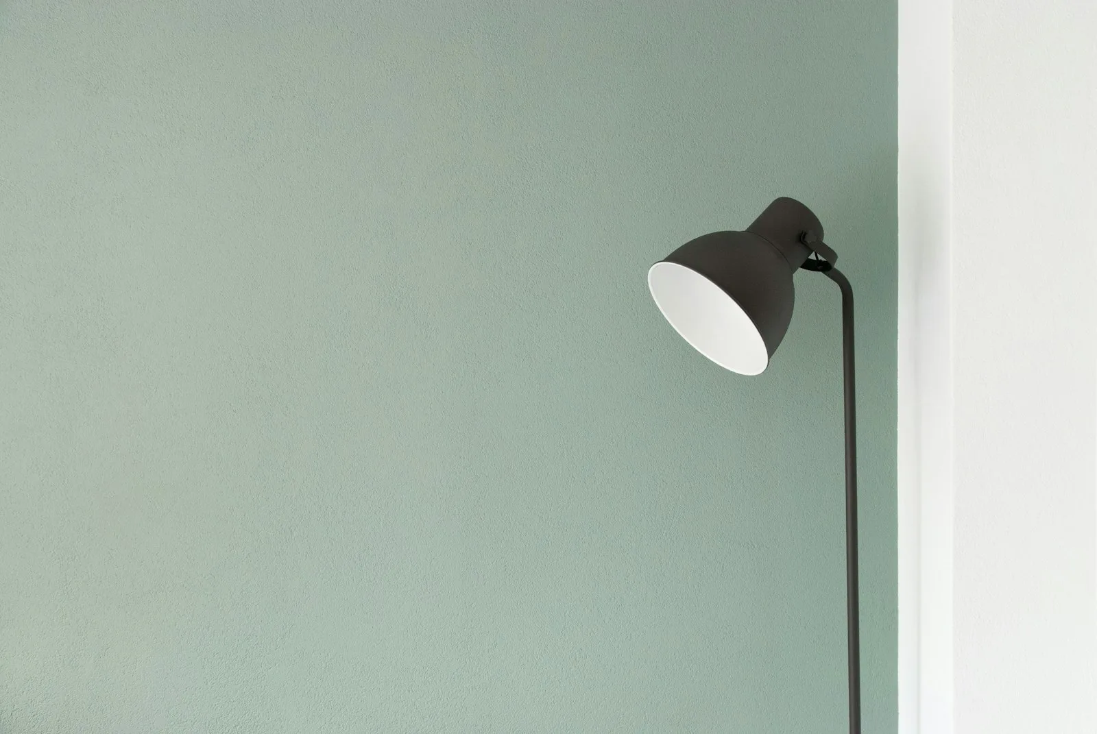
Summer Light, Winter Grids
On designing for season and why the best editorial systems change with the months.
Magazines that publish year-round face a design challenge that most design systems are not built to accommodate: the same system must work in June and in January, when the light, the mood, and the reader’s relationship to the page are substantially different.
The problem with evergreen systems
Most editorial design systems are built for consistency. The grid, the type scale, the colour palette, the image treatment - these are fixed at the outset and applied across all issues. Consistency is a virtue: it creates recognition, builds trust, and makes production manageable.
But consistency has costs. A system designed to work equally well in all conditions ends up optimised for none. The cool grey that looks elegant in winter reads as cold and uninviting in August. The generous white space that feels airy in spring can feel empty and sparse in the dark months when readers want density and warmth.
The best magazines address this without abandoning their systems. They build seasonal variation into the system itself.
Summer: openness and saturation
Summer editorial design works with rather than against the reader’s relationship to light and outdoor space. Pages feel opened up. Images are larger, more saturated, more willing to bleed. White space is generous without feeling sparse. Colour, where it appears, is warm rather than cool.
This is not about putting suns on covers. It is about structural decisions: line length, image proportion, the weight of type. A summer page has more air in it. It does not demand close sustained reading in the way that winter content does. It invites browsing.
The photography changes too. Summer editorial imagery tends towards environment - context, location, the world around the subject rather than the subject itself. The light in summer photographs is harder and more directional. Shadows have edges. Everything is more present.
Winter: density and warmth
Winter design compensates for the reduction in natural light and the reader’s inclination toward longer, more sustained reading. Pages become denser. Pull quotes multiply. The relationship between text and image shifts toward text. Colour moves toward warmth - amber, burgundy, deep green rather than the cool blues and whites that work in summer.
This is also not cosmetic. It is structural. The grid tightens. Columns narrow slightly, increasing words per line and the sense of density. Type weight increases marginally. The effect, when done well, is that the page feels more substantial - more like a book than a newspaper, more like something to sit with than to skim.
Building seasonal variation in
The challenge for editorial designers is to build these variations into a single coherent system rather than producing two separate systems that happen to share a logo.
The solution, when it works, is usually a kit of parts with seasonal modes rather than seasonal versions. The same grid, used with different proportions. The same type family, used at different weights. The same colour system, with seasonal ranges defined within it.
What changes is which parts of the kit are deployed, and in what combination. The reader recognises the publication across issues because the underlying vocabulary is consistent. But the issues feel different from each other in ways that are meaningful rather than arbitrary.
Why it matters
This is not a purely aesthetic argument. Publications that feel seasonally appropriate to their readers perform better. There is a kind of readerly alienation that occurs when the visual tone of a publication is disconnected from the reader’s experience of the world. It is subtle and largely below the threshold of consciousness, but it registers.
A winter issue that feels like it was designed in August asks the reader to do work that the design should be doing. It creates a small but real friction between the object and the context in which it is read. Removing that friction is the work of seasonal design.
The grid serves the reader. When the reader changes with the months, so should the grid.
- ★★★★★
Finally someone writes about seasonal design without resorting to mood boards. Thoughtful and original.
- ★★★★★
The winter grids section is stronger than the summer half, but both land well.
- ★★★★★
Sent this to my whole studio. The point about warmth being structural rather than cosmetic needed saying.
Leave a review
Sample reviews above are demo content. On a Netlify deploy this form is collected with Netlify Forms; it does not appear in the list until you connect a CMS.
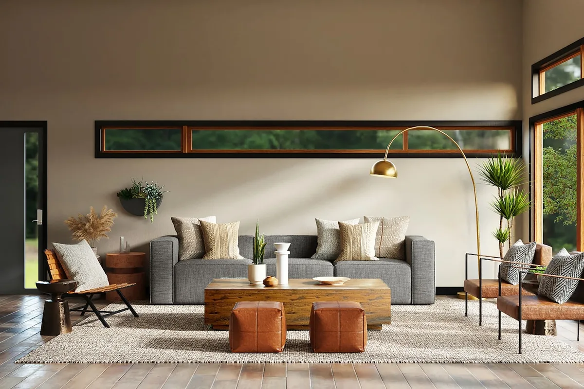
The Geometry of Quiet Rooms
How negative space, daylight, and a single axis of furniture can make a room feel finished without feeling full.

Type That Holds a City Together
Why wayfinding, newspaper mastheads, and subway maps still teach the best lessons in hierarchy.

Borrowed Light
How architects and photographers chase the same fleeting quality - the light that belongs to a moment, not a room.